Portal to the Past – You’ll be surprised what you find in the Archives
- October 10, 2019
Taking up from Emma Horgan’s post last week I’d like to introduce some of the thought-processes behind our choice of images.
From past experience when I introduce the idea of what archival material is, some people can look blankly at me….”what did she say?“, some will answer “old stuff”, or else it’s “dusty things”, which I’ll grant you is usually the case.
So, when Elaine, Emma and I sat down to discuss what would we choose from the collections in Special Collections & Archives, we all agreed we wanted visual material and we wanted people to realise that “old stuff in a library” is not just books, text and paper, but memories, ideas, and maybe even a little bit of time-travel to bring you to a place or experience you’ve had that others have had before you.
Photographs
Who hasn’t sat on a rock along a coastline and looked out to sea, like Frank O’Connor (see previous post) or posed awkwardly for a photograph you don’t really want to pose for and think to yourself “would you get on with it” which, if you look at the photograph of George Boole (BP/1/356), could this have been running across his mind?
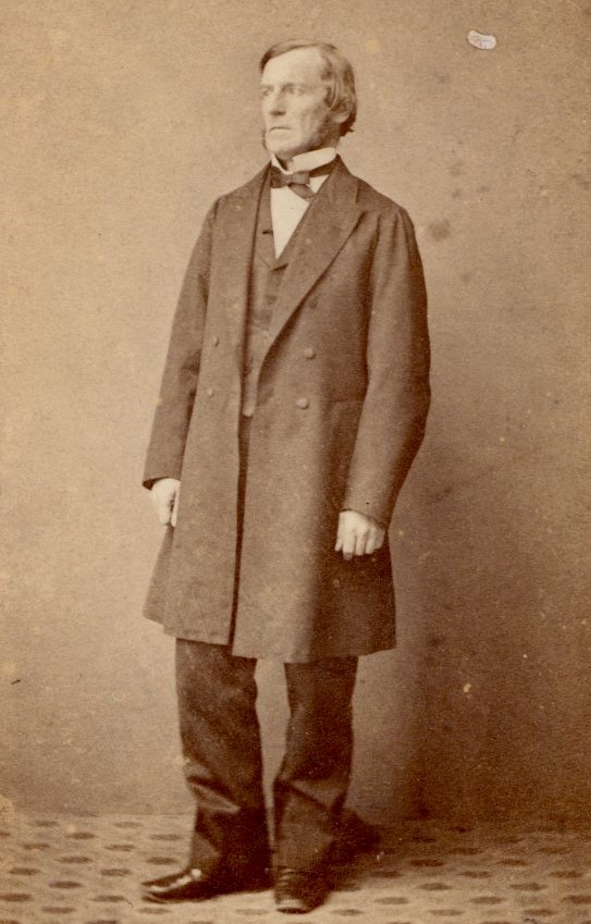
I’m often asked by visitors why isn’t George Boole smiling in that photograph or that he looks really serious. Well, maybe he didn’t feel comfortable or was thinking he should be somewhere else, but it’s more likely mid-19th century photography meant you had to hold still for a long time in order to get the exposure and image. You might look a little stiff too if you had to stand still in the alien environment that was a photographic studio with its props and mechanisms (the loud bang and after-smoke of a flash?). However, by all accounts from his letters between him, his family, friends and peers that form the majority of the Papers of George Boole held in UCC Library, George was a considerate, thoughtful individual, quick to discuss an idea introduced by himself or by others, and not just mathematical. There are even examples of Boole’s poetry, and its probably fair to say after reading them that we’re glad he concentrated on mathematical processes.
Sketchbooks
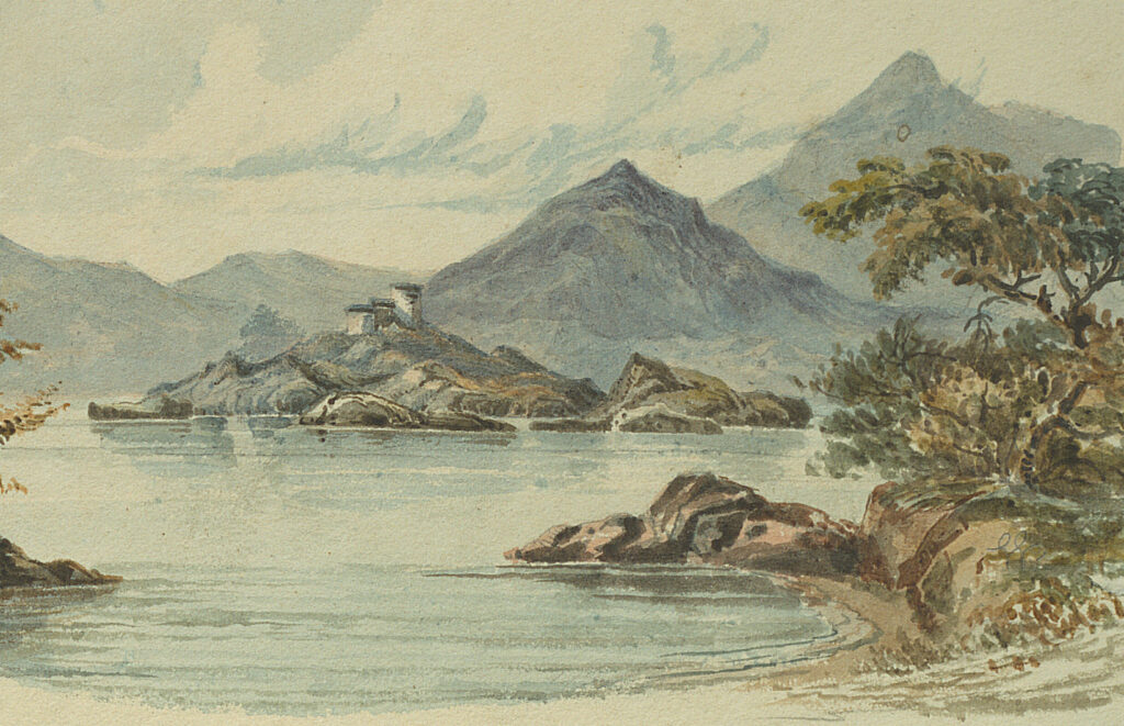
Speaking of time-travelling, one of the first annual Summer school-tours I remember from national school was a trip to Bantry and Glengarriff which included, if the weather was good i.e. not too wet, a boat-trip to Garnish Island. I chose the colourful watercolour of Garnish from one of the many sketchbooks (BL/EP/B/3304) contained in the Bantry Estate Collection, as it reminds me of those school trips. Sketchbooks can show the places that people lived near or visited, and they are the pre-photographic album of their day, capturing the view of the mountain, lake, street, port or the people observed by the artist. By the way, if you haven’t been to West Cork yet, do yourself a favour and make the time.
Postcards
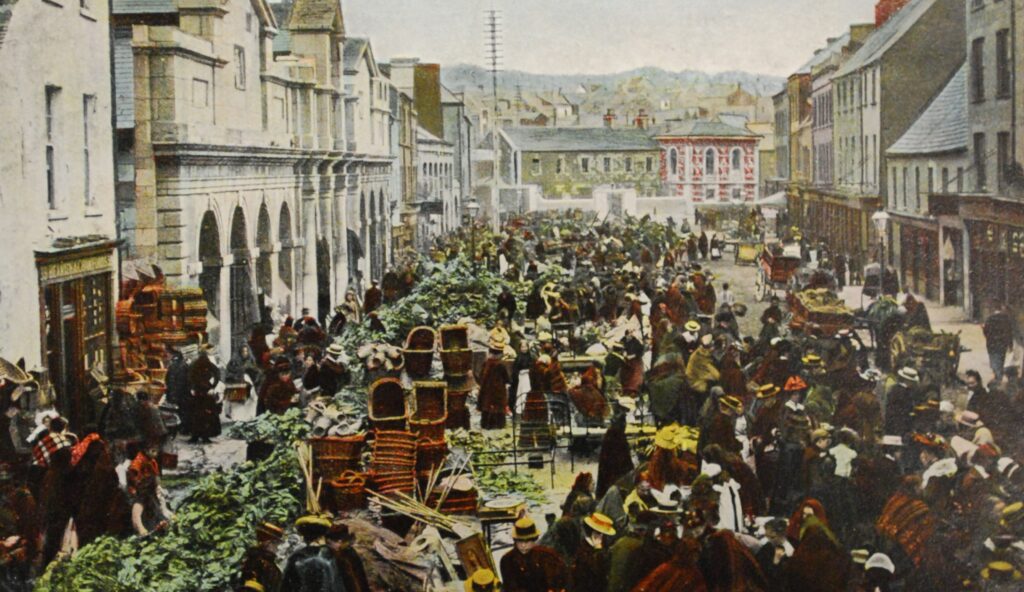
If you don’t have time to go to West Cork, a place featured nearer to UCC is the Coal Quay in the centre of Cork city. The image of Paddy’s Market at the Coal Quay (BL/SC/P&E/10) is actually a postcard and looks like a colourised copy of a B&W photograph. We think this was taken around the 1900s. It shows the crowds milling about with barely room to move, the traders at their stalls, carts on the other side of the street, and lots of stacked wicker baskets. Take a closer look at the image and you’ll notice the buildings on the left side are still there if you visit the Coal Quay today, whereas the buildings on the right have been developed over the years. Postcards are found within many archival collections, or as collections in themselves, like this one from Postcards and Ephemera. They are the quick note of greetings from a writer, usually assuring the receiver of a good time being enjoyed, with all going well.
Graphic Designs
In the blog post last week Emma wrote about a number of other images chosen for our Portal to the Past, including a bookmark design by Elizabeth Friedlander. Another image chosen from this collection illustrates Friedlander’s intricated border designs and her own custom designed font ‘Elizabeth’ (BL/VC/EF/Box 3/Folder 5).
Friedlander began her foray into the world of graphic design by studying art at the Berlin Academy, specialising in typography and calligraphy, under Emil Rudolf Weiss. She then worked for the Jewish publishing house of Ullstein Verlag, Berlin, designing headings for its fashion journal Die Dame. In 1927-8 Friedlander was invited to design a typeface for the Bauer Typefoundry; which was completed in 1938. Normal practice would have named the typeface by the designer’s surname, but ‘Friedländer’ was considered too Jewish for the time and it was instead issued as ‘Elizabeth’. It was also considered unusual at the time for a woman to be commissioned to create a font.
Archival Collections at UCC Library
The images chosen from these featured archival collections are only a sample of the type of material we hold across the personal, business, landed estate and visual collections in UCC Library Archives Service. We’d like you to consider that any material can form part of an archive and that more than likely, you or your family have these.
In the final blog post for Portal to the Past next week, our colleague Elaine Harrington will explain her choices of images from publications in Special Collections.
