Portal to the Past! You’ll Be Surprised By What Can Find!
- September 25, 2019
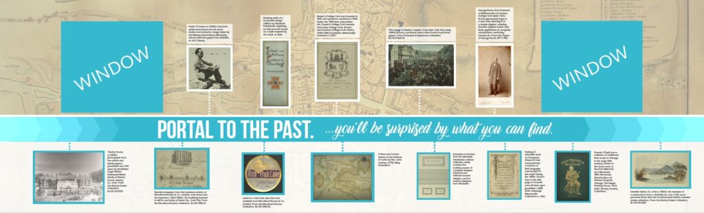
Have you spotted the new wall design outside Special Collections & Archives? In an age where people use and rely on the web and digital content we wanted to show we are more than old text-based documents or old and rare books. We wanted to showcase a variety of primary sources in a tangible manner and to do that we used different images of people, places and things. These images give a snapshot of the range of what UCC Library’s unique and distinct collections encompass. Any library can have a copy of George Boole’s An Investigation of the Laws of Thought. After all it has been printed numerous times by numerous publishers. However no other library has George Boole’s personal copy of An Investigation of the Laws of Thought or his personal papers. UCC Library has unique and distinct George Boole collections. However it’s not all about Boole!
Thematic Choices
We deliberately haven’t chosen obvious material from the collections as Special Collections & Archives is more than JUST treasures. We chose items we thought anyone might be interested in. Special Collections & Archives isn’t for learned scholars alone but for everyone. Once we had this frame of mind we brainstormed to the theme “You’ll be surprised by what you can find.” We adapted Mitchell, Seiden & Taraba’s book title Past or Portal? to form the other part of the tagline: Portal to the Past.
Selecting Items
We deliberately chose visual examples – who reads text?! We weren’t creating an exhibition so we selected individual images rather than using panels on the wall. We wanted the objects to talk to the viewer: a ‘speed-dating’ with the object as it were. All the captions for the images are quite short but are present, so if you like the look of something and would like to see more then you know the call number to request it.
When selecting we always have more possibilities than space. We considered using an Elizabeth Friedlander border along the wall’s edge to show the end to the display but instead used one part of a Friedlander graphic design.

We considered using George Boole as a ‘tour guide’ for the wall but instead chose to reverse a photo of Frank O’Connor and now it seems as if George and Frank are having a conversation across time. We wanted to show the depth of the business archives and could have used items from Murphy’s Brewery but ultimately the advertising produce labels of Woodford Bourne won out.

Design Choices
In some instances our choices were limited by which images we had copyright clearance on and others where we couldn’t get a high enough quality image and this was important for the graphic designers. We worked with Babelfís over a six month period from initial assessment on site to installation. During this time a number of preliminary proofs were proposed and we distilled various parts until we had a working proof. Babelfís incorporated the windows looking from the corridor in Q-1 into the Rare Books Reading Room into the design as the eponymous ‘portals.’ We liked using an image as if it were a watermark for the background but swapped the image initially used for William Beauford’s 1801 map of Cork. At one point the fonts for ‘Portal to the Past’ and ‘You’ll Be Surprised By What You Can Find’ were reversed. As the graphic design proofs grew more detailed we realised that the captions on the top part were harder to read: white text against an orange map background. The next version saw the captions in black on white transparent boxes. Towards the end of the design process we finalised captions and stylistic choices: using italics for titles, and Babelfís wrapped the design around the wall to the entrance to Special Collections & Archives.

What Didn’t Make It?
So what didn’t make the cut? What didn’t make the brief of ‘Portal to the Past. You’ll Be Surprised By What You’ll Find’? Over the next few blog posts Emer Twomey, Emma Horgan and I will describe each of our choices and talk to you about what we would have included if we could have:
“Portal to the Past – Discover what you’ll find in the Archive” by Emma Horgan
